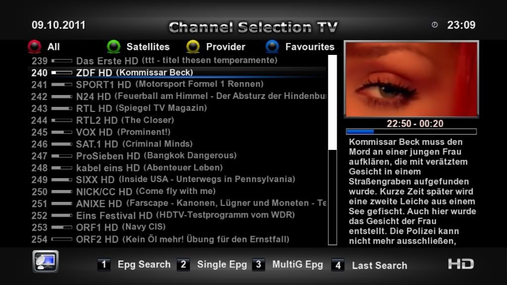
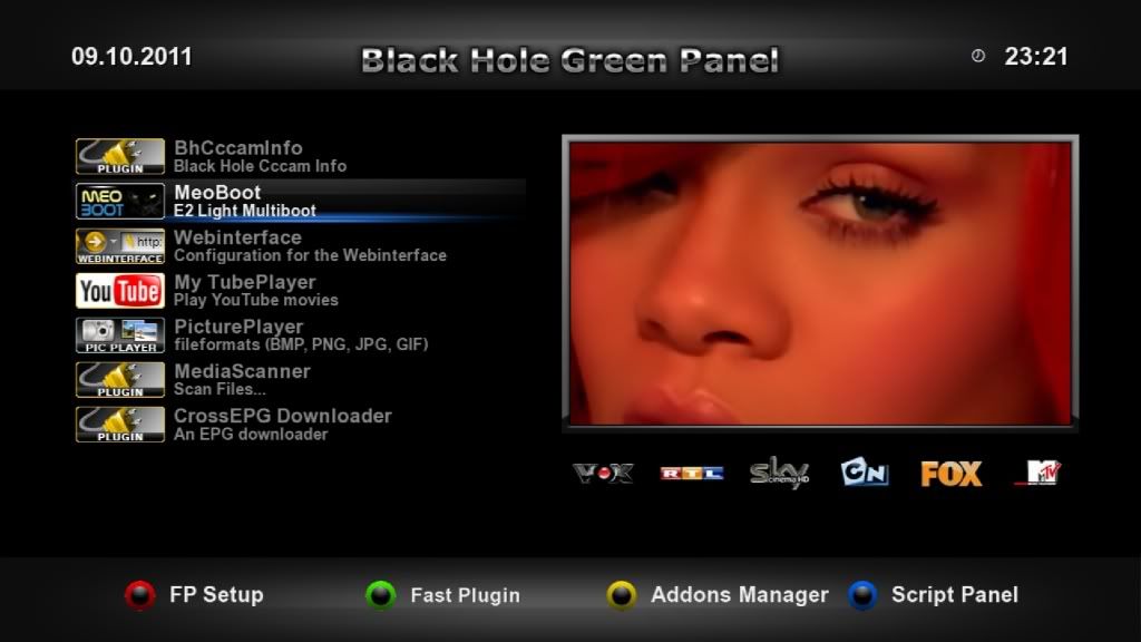
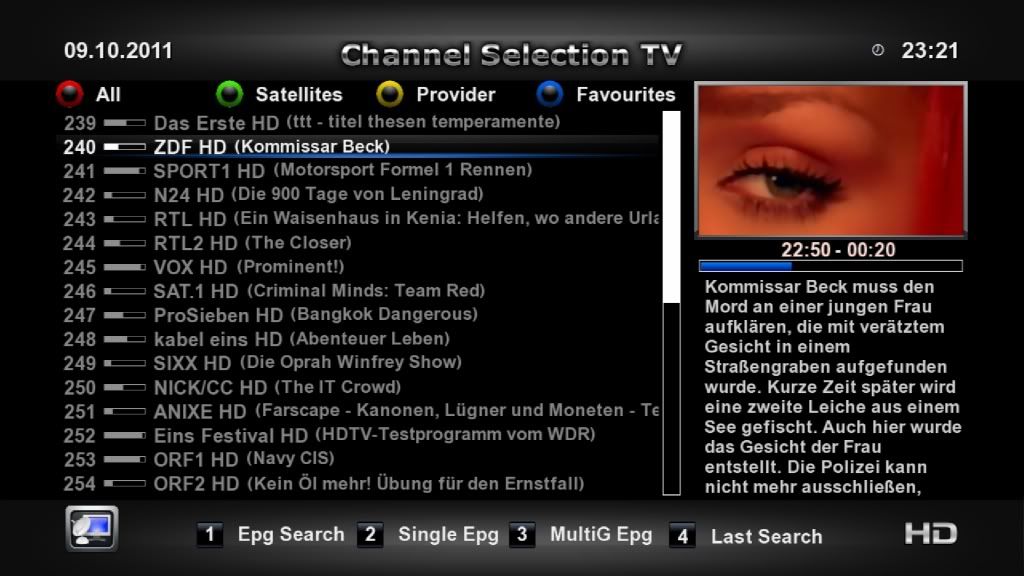
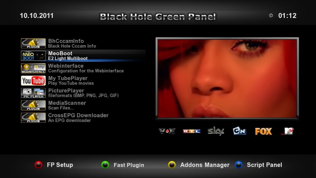
Rihanna

Dzoni

BH Lover
Rihanna 5

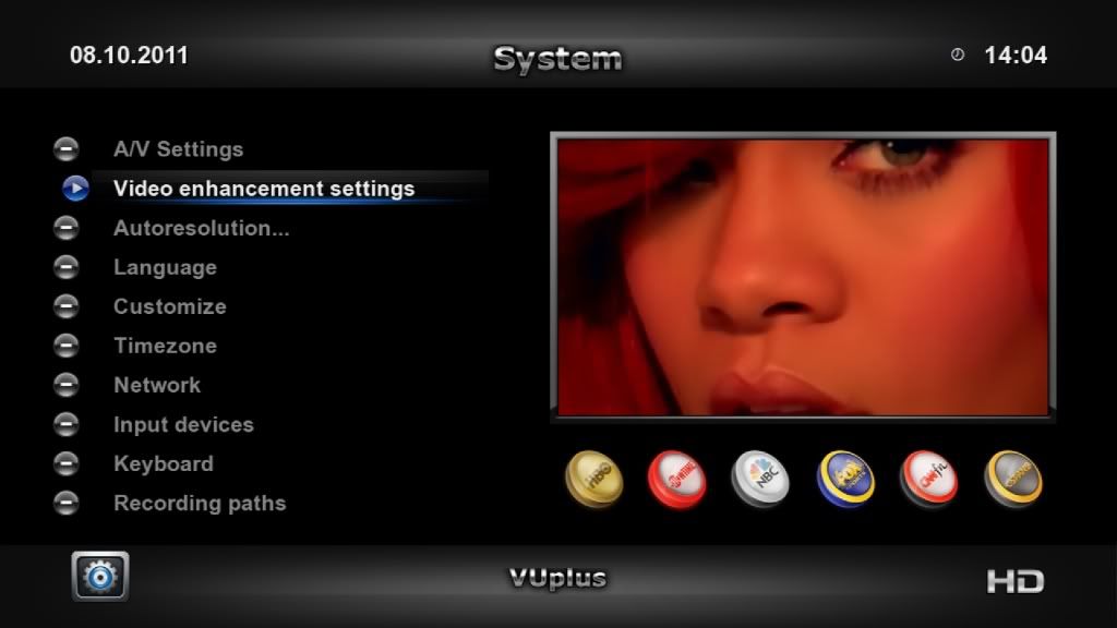
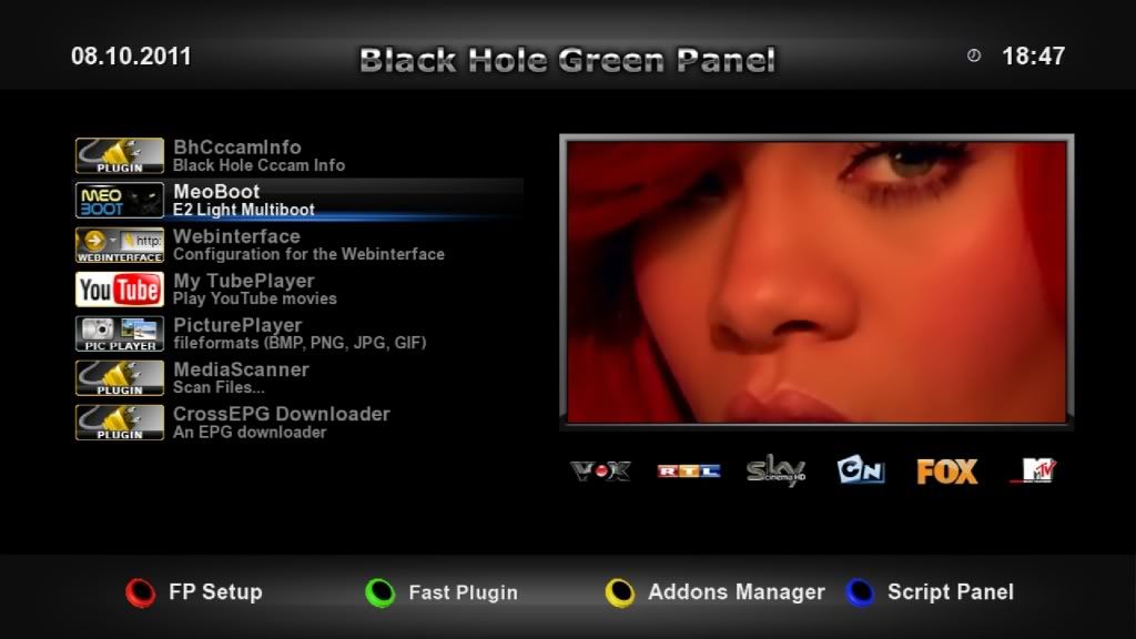
What you want to have in the Menu
make a choice for channel icons
Under the PIG monitor.
(icons in my last post, or these)
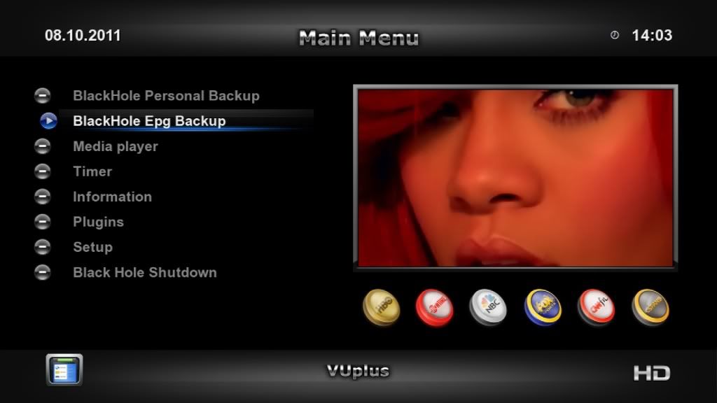
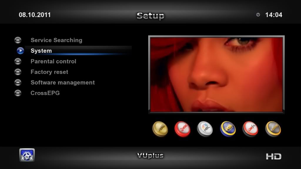
shot1-106.jpg


shot2-96.jpg


shot3-75.jpg

Hmmm, this idea is also very interesting but You did not post examples with smaller buttons. Also try the buttons are in a counter angle (down / up) with the inscription that will accompany it.
 

Dzoni

BH Lover
I do not like this buttons solution,for me not look very good. Old idea is a better and look more professional compared with this. But tastes are different.
 

Matrix10

Administrator
I do not like this buttons solution,for me not look very good. Old idea is a better and look more professional compared with this. But tastes are different.

Then you have to make a definitive choice , because I will no longer make new buttons
Choose from these three series.
 

Dzoni

BH Lover
This is better and seriously solution ! Maybe is for someone every time all OK, or can not and does not want to say otherwise. The taste is different categories but the difference in graphics quality is noticeable.
 

@MujaG@

BH Lover
The Rihana 4 is simly the BEST!!!!
@Matrih...keep up gooooood work mate,BLESS YOU!!
Respect and cheers
 

biscamax

BH Lover
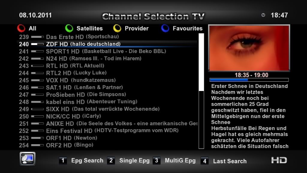
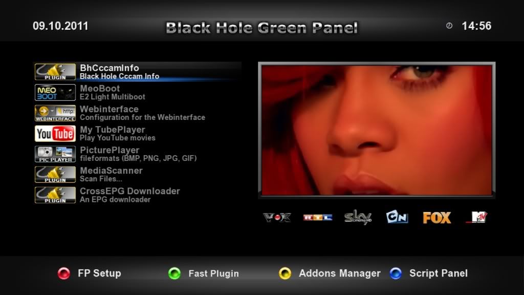
About channel icons, my choice goes to picons, the buttons are ok but graphically is not the best choice in this skin.

About colour buttons, generally I like it all, but about 2 final ideas, I don't like too much those points (located in, west and east positions on idea Nº1, and south, west and east positions on idea Nº2), they look like graphic imperfections, I know are not, but in some backgrouds, those points simply disappear more in some colours than others, maybe because they are too small, and maybe this happens just in photos and not in reality.
 

Matrix10

Administrator
About channel icons, my choice goes to picons, the buttons are ok but graphically is not the best choice in this skin.

About colour buttons, generally I like it all, but about 2 final ideas, I don't like too much those points (located in, west and east positions on idea Nº1, and south, west and east positions on idea Nº2), they look like graphic imperfections, I know are not, but in some backgrouds, those points simply disappear more in some colours than others, maybe because they are too small, and maybe this happens just in photos and not in reality.

Yes I agree
but now it is resolved with coding, so that you no longer see any black edges
and the edges are the maximum part of the whole background
so it is almost perfect.

shot5-27.jpg
 
Top